Print Project Assignment
About
HAUOLI is a fictional venture born from a graphic design project at John Bryce College, portraying the marketing of organic tropical fruit coconut milk-based juices. the name is inspired by the Hawaiian language and translates to “be happy,” capturing the essence of selling not just a beverage but an experience of happiness and tropical delight.
Vision
The comprehensive vision involves designing a logo that embodies the Hawaiian ambiance, highlights nature, and features the vibrant, fresh colors inspired by tropical fruits. Moreover, the objective is to highlight the significance of coconut milk in shaping the identity of the brand’s products such as packaging and bottle labeling.
Design Progression
Mood Board
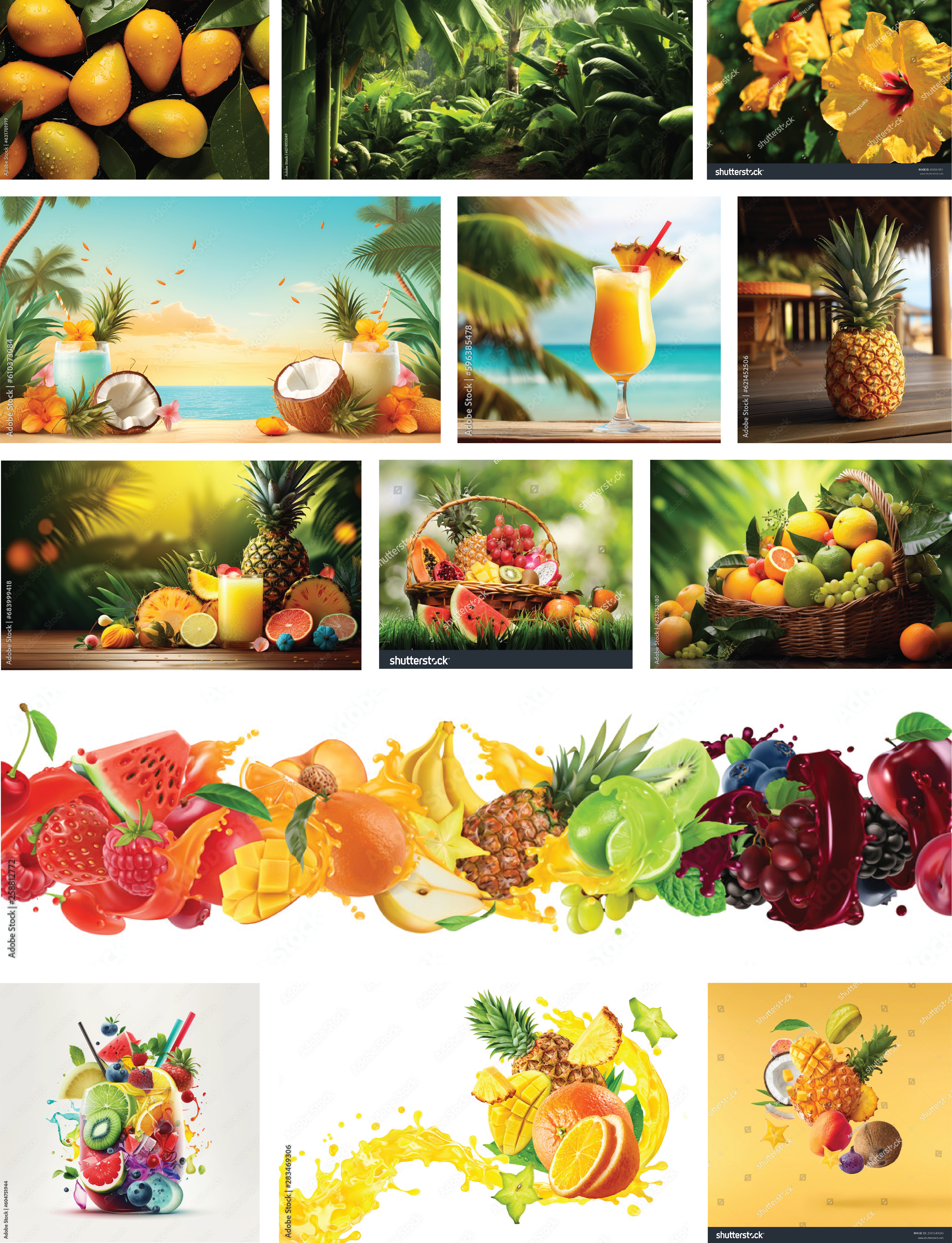
Within the vision framework, a collection of images has been gathered to draw inspiration from the diverse Hawaiian vibes, with the photos reflecting the freshness of fruits and nature. Moreover, images displaying joyful colors were selected to convey both the brand name and its essence.
Color Choice
The chosen color palette revolves around yellow and green. Together, these colors not only evoke a vacation-like, tropical atmosphere but also capture the essence of happiness, calmness, and nature that defines Hauoli.
#FFCA0B

The yellow color represents the vibrant hibiscus flower – Hawaii’s state flower, and exudes cheerfulness and happiness. This color resonates with the tropical fruits featured on the mood board, creating a connection to the essence of Hauoli – a brand synonymous with joy. The tropical, happy feeling it imparts aligns seamlessly with the Hawaiian vibe the brand seeks to embody.
#92A23A

The green color signifies nature, freshness, and tranquility. It complements the organic essence of the product, inducing a sense of calmness that harmonizes with the natural, refreshing qualities of the tropical fruit juices.
Typography
For the logo typography, a Sans serif font was initially selected, and later customized to infuse a more organic character. This deliberate modification moves away from a rigid and digital appearance, introducing subtle curvature to evoke a natural, unprocessed feel. The aim is to align with Hauoli’s identity as an organic juice industry, emphasizing freshness and a connection to nature. The adjusted typography not only enhances the overall natural vibe but also symbolizes the organic nature of the brand, mirroring the unprocessed quality of its fresh fruit juices.
Azo Sans Uber Regular


Evolving Form
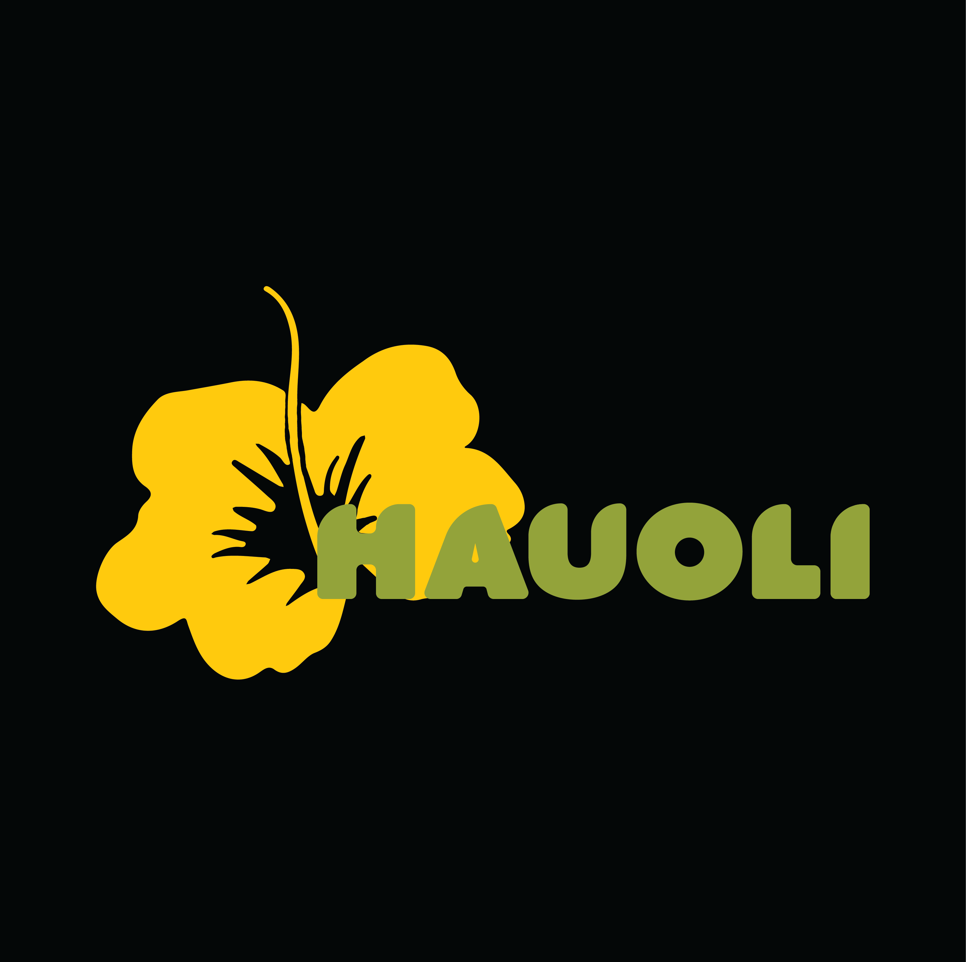
For the icon shape, and to emphasize the desired Hawaiian essence, I chose Hawaii’s State Flower – Pua Alo Alo
(also known as yellow hibiscus).



Final Logo
Black & White Version
Color Version
Products Identity
Typography
For the product typography, I opted for a typeface closely resembling the original logo typography – Azo Sans Uber Regular – before customization. This choice aims to maintain a cohesive visual identity, aligning with the original design elements of the brand.

Bottle labels
In crafting the bottle labels, a deliberate focus was placed on highlighting the key ingredient of the juice – coconut milk. To accentuate this, a dynamic “splash” design was conceptualized, merging with the transparent background that reveals the actual juice color inside the bottle, representing the fruit’s presence. Within this “splash”, the name of the fruit juice capturing the taste is embedded. Meanwhile, in the transparent area showcasing the fruit color, the words “Coconut Milk Based” are presented, creating a balanced composition. This reinforces the idea that coconut milk holds equal significance to the vibrant fruit flavors, establishing a harmonious hierarchy in the label design.
Packaging
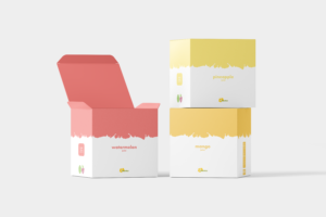
In the packaging, I extended the same concept utilized in the labels, with a slight modification. Instead of the transparent part, I assigned a distinct color to each specific fruit, aligning with its taste. Each package features the color associated with that particular fruit, incorporating the splash and design elements inspired by the labeling. This consistent approach ensures that the packaging vividly represents the flavor of the juice inside, mirroring the visual identity established through the labels.
Mock Up Gallery


