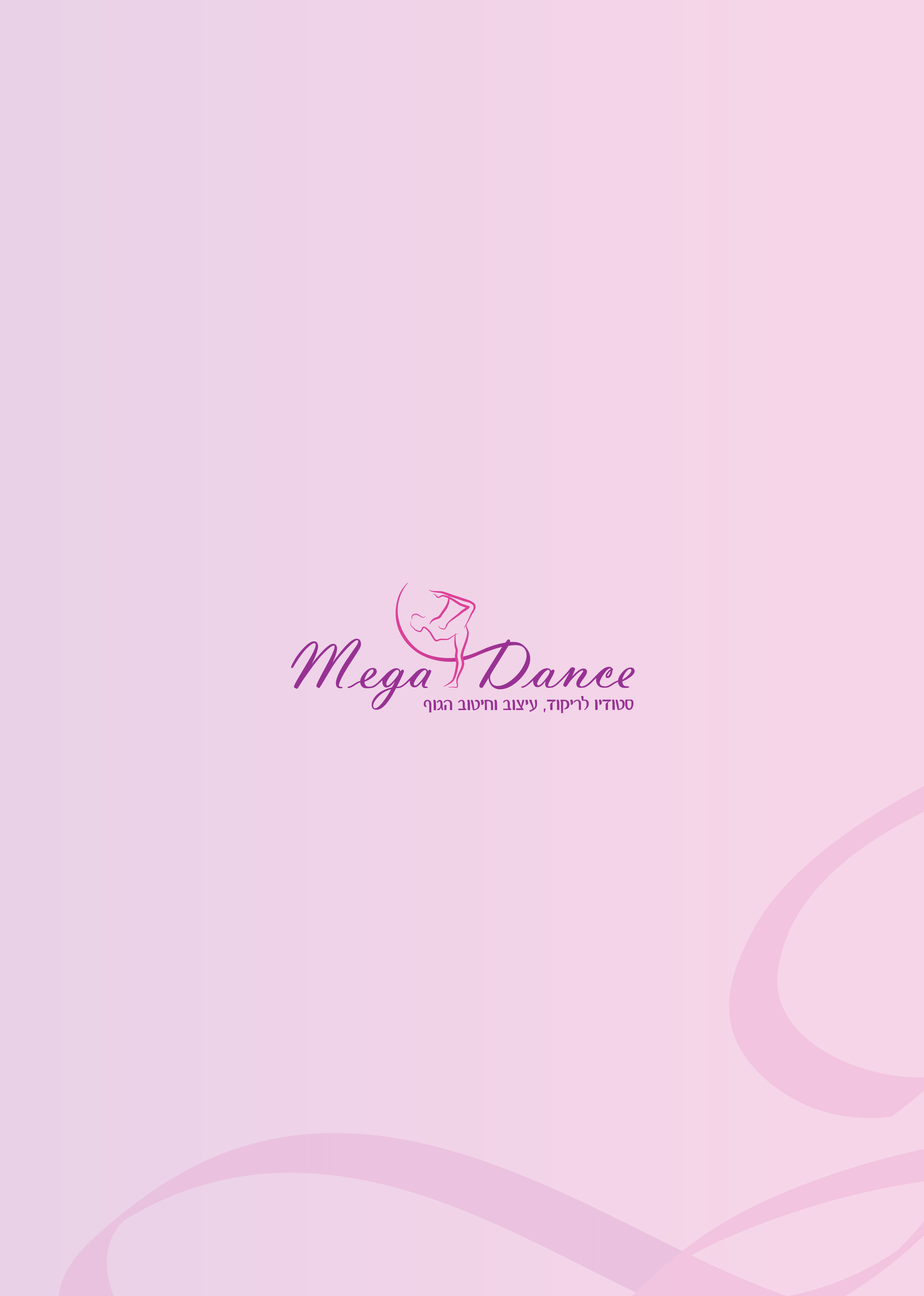
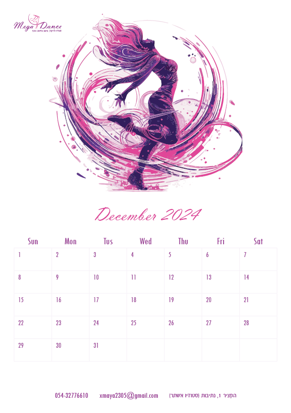
Mega Dance Studio, founded by Maya Maimon in 2004, is a dance studio designed for women and girls from the age of 14, and focuses on providing dance and programs while encouraging social interactions for the studio members. Due to the effects of COVID-19, the studio temporarily halted its activities for two years. Following the conclusion of the pandemic, the founder decided to reopen the studio, along with a rebranding process to redefine its identity.
Client’s Vision
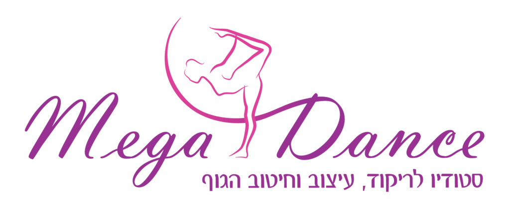
The client envisions a captivating logo that encapsulates the essence of movement, vibrant and lively colors, and the joy associated with dance and embodying the spirit of Mega Dance. They specifically desire a woman’s silhouette in the logo, symbolizing the studio’s commitment to empowering women through opportunities for fitness, health, and social engagement.
Design Progression
In response to the client’s vision, vibrant and energetic colors were sought to infuse the logo with a lively and enjoyable essence, embodying the spirit of Megadance Studio
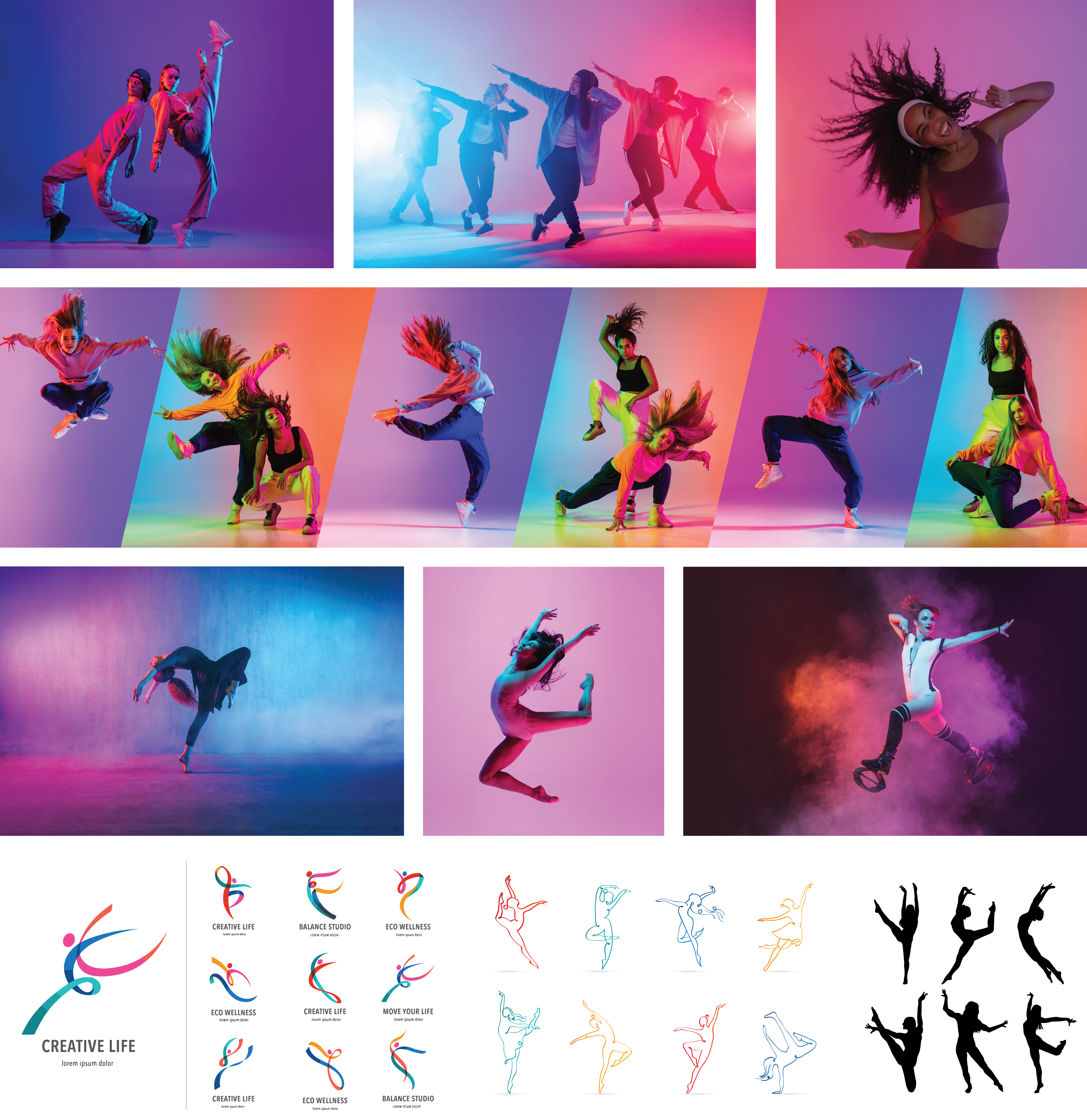
Mood Board
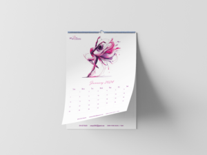
I chose images of A variety of dance types and outlines that convey energetic colors, joy, passion, and, most importantly, movement.
Color Choice
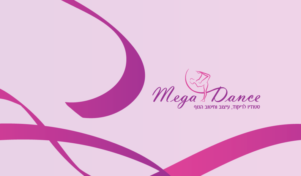
The color selection process draws inspiration from the dominant and energetic hues found in my mood board. These colors symbolize energy, passion, movement, and rhythm, reminiscent of the vibrant sounds often associated with music. The result is a dynamic and lively atmosphere, evoking a sense of joy and a desire to dance. Moreover, the chosen colors, primarily pink and purple, convey an additional feeling of effervescence and energy, echoing the infectious sounds of joyful music. Beyond their visual impact, these colors resonate as distinctly feminine, perfectly aligning with the studio’s focus on empowering women and contributing to their well-being. The color palette not only reveals the vibrant and energetic essence of the studio but also aligns with the client’s vision for a logo that captures attention, exudes interest, and radiates positivity.
#DC4298
#973393
Gradient
Typography
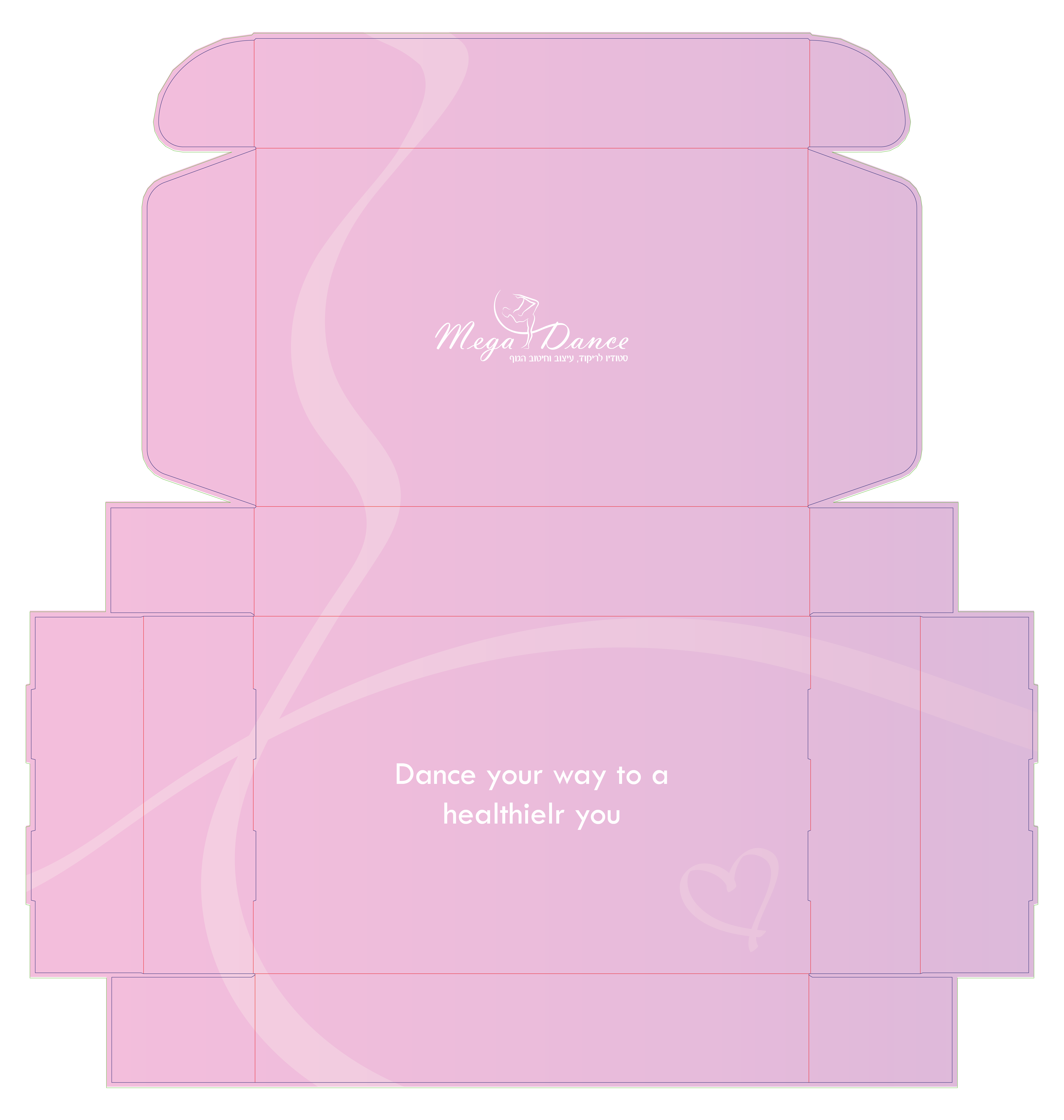
Vladimir Script – Logo
The logo font chosen embodies a sense of movement, resembling the flowing lines of a gymnastics ribbon. Its smooth and delicate curves contribute to a classic yet modern feel. With a touch of femininity, it almost resembles a woman’s handwriting, aligning perfectly with the outlines and contours of the icon. This font’s flowing nature adds a dynamic and timeless quality to the overall design.
Felix007 – Slogan
The font the logo font with its delicate curves, flowing gracefully and matching the overall theme. Unlike the logo font’s slight inclination, this font is straight, offering stability and a firm foundation. Positioned at the end of the logo, its straight and stable design signifies confidence and reassurance, emphasizing the dancer’s stable foundation in the studio.
Evolving Form
Client feedback: Maintain the former logo’s silhouette positon.